← Back to portfolio 🌿 the research and reasoning behind EVOL
🌿

EVOL

Fourteen pages covering how this project actually came together β€” before it had a name, before it had screens, before I knew if it would work.

β€” early notes

It started as something else

Before it was EVOL, I was calling it "Project LOVE." The name EVOL only came later β€” it's LOVE spelled backwards.

According to psychology, love is the purest form of emotion β€” sometimes an overrated one, sometimes an underrated one. This project needed the overrated side: the stage right after love, which is either marriage or heartbreak. The word LOVE had to be present in this project. Just not in the same way.

"there is a love after love. there is a life after love."

1
β€” first sketch, on paper

The page I drew first

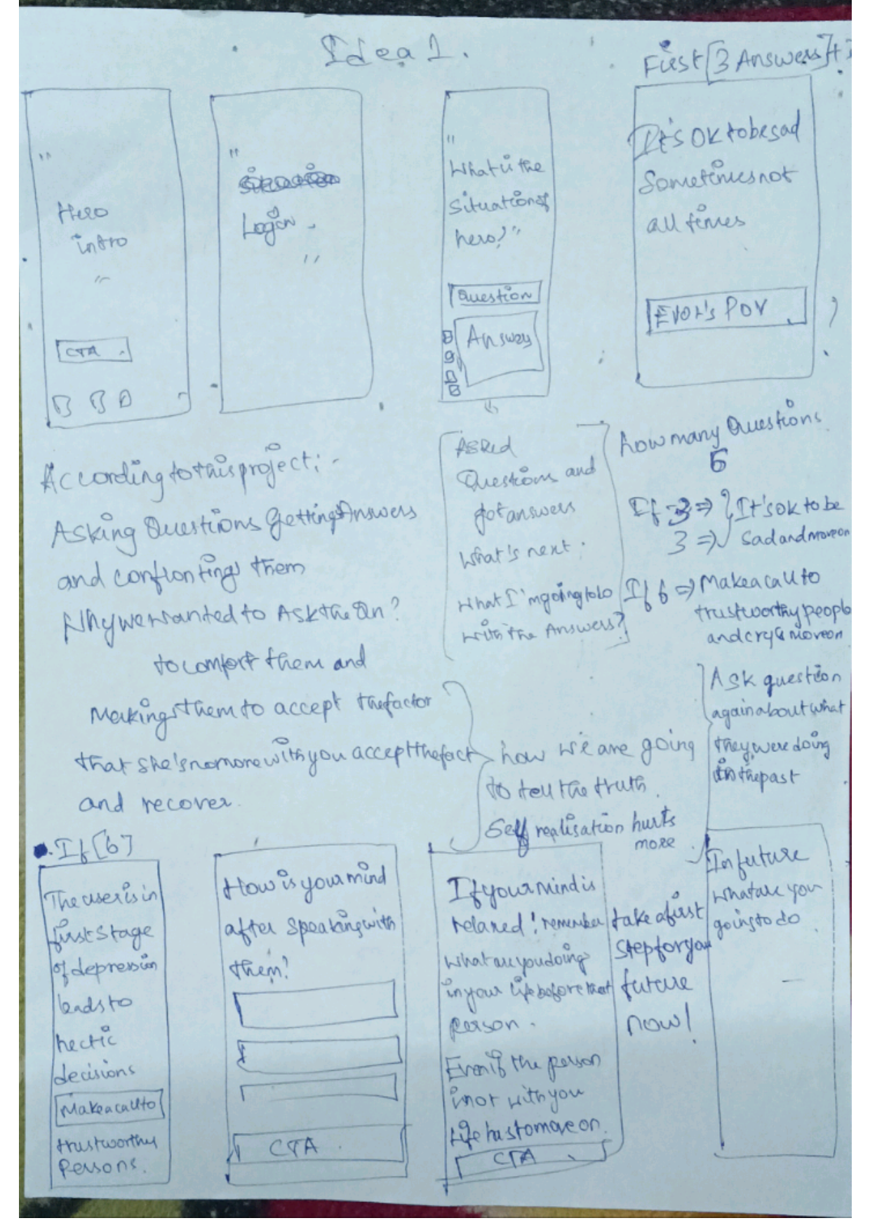
Before Figma, before any real flow β€” this is the actual first page. Rough in places, but it's where the branching logic started as a question I was asking myself, not an answer yet.

EVOL first hand-drawn wireframe sketch, Ideal 1 2
β€” the problem, plainly

What people actually miss

While exploring breakup recovery, I noticed a pattern: people rarely struggle only because they lost a person. They struggle because they lose the small things built around that relationship β€” daily routines, emotional support, a sense of security, and sometimes even the version of themselves they had become.

Most recovery advice focuses on one of two extremes. It either tells people to β€œmove on” quickly, as if years of memories can be switched off, or it keeps them stuck by repeatedly asking them to revisit the breakup β€” what happened, why it happened, and who was responsible.

The real challenge was different:

How might we help someone rebuild their identity and daily life after a breakup without forcing them to forget the past or constantly relive it?

3
β€” three rules, before Figma

What I wouldn't do

  • No character names. Had to work identically for anyone, any relationship β€” no ex-partner name, no gendered defaults, nothing that reads as taking a side.
  • Recovery, not amnesia. EVOL never tells anyone to forget it happened. The goal is remembering who you are, not erasing who you loved.
  • Every frame earns its place. Cutting a screen is a design skill, not a shortcut.
4
β€” grounded in more than opinion

Not invented breakup advice

I didn't want EVOL to be based only on assumptions about how people recover from a breakup. Before finalizing the experience, I attended three counselling sessions with a psychologist to understand how breakup recovery actually works, how the 21-day no-contact approach affects people, and whether users would accept an app as a support tool during recovery.

One important takeaway was that recovery is not about forcing someone to forget the past. It is about helping them slowly rebuild their identity outside the relationship.

That changed how I approached the product:

  • Honouring the grief β€” EVOL does not rush users to "move on." Some moments are designed to acknowledge sadness without keeping them stuck in it.
  • The 21-day no-contact window β€” I explored how this period works psychologically before building any feature around it, instead of treating it as just a popular internet rule.
  • Reframing the narrative β€” Instead of repeatedly asking users what went wrong, EVOL encourages them to reconnect with routines, interests, and parts of themselves that existed before the relationship.
5
β€” second-guessing

The frame I almost cut

I wrote myself a rule partway through: "a good designer isn't the one who adds elements β€” a good designer knows which ones need to be deleted." The login frame almost didn't survive that rule. I kept it, but only after asking whether it earned its place.

still not 100% sure I was right to keep it.

6
β€” the hard part, in full

The hardest screen to design

This was the screen I kept coming back to during the project.

The challenge was not creating six questions β€” it was deciding what the product should do after someone answers them. A person using EVOL might simply be having a difficult day, or they might be experiencing something deeper. The app needed to respond with care without pretending it could understand or diagnose their emotional state.

The solution was to create two paths:

  • If fewer than 5 of 6 questions are answered:EVOL does not push the user further. It provides reassurance and allows them to continue at their own pace.
  • If all 6 questions indicate a stronger emotional struggle:The app recognizes its limitation and encourages the user to connect with trusted people instead of depending only on the product.
  • This decision became an important principle for EVOL β€” a product can provide support, but it should also know when real human support is needed.
  • The branching logic is only a simple concept-level approach. A real product would need validation and guidance from mental health professionals before being used in a real recovery journey.

I want to be upfront: this branching logic is a simple answer-count heuristic, not a validated screening tool. Reasonable for a concept project β€” but a real version needs a licensed mental health professional defining that signal, not just my judgment.

7
β€” The journey through eight frames

How the eight frames flow

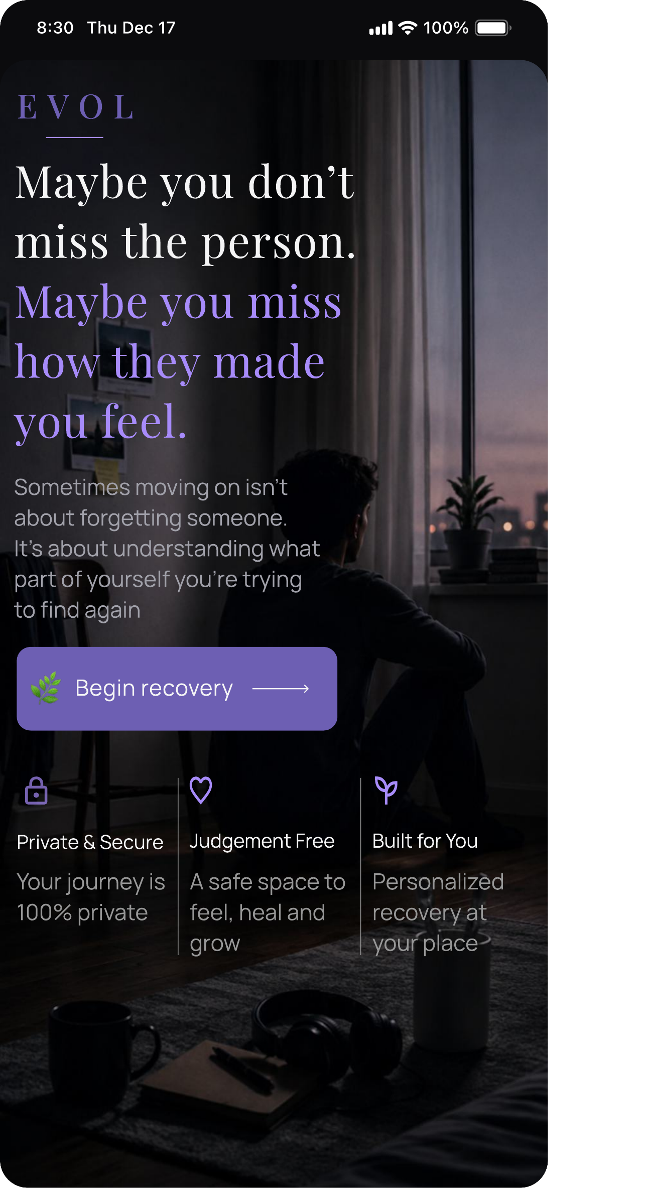
  • 1 β€” reframe, don't relive. "Maybe you don't miss the person, maybe you miss how they made you feel."
  • 2–3 β€” sign in, then ask differently. Skips "why did it end," asks what changed instead.
  • 4–5 β€” the branch point. Reassurance, or a nudge toward the trusted circle.
  • 6 β€” after the call. If not relaxed yet: music, going outside, a walk.
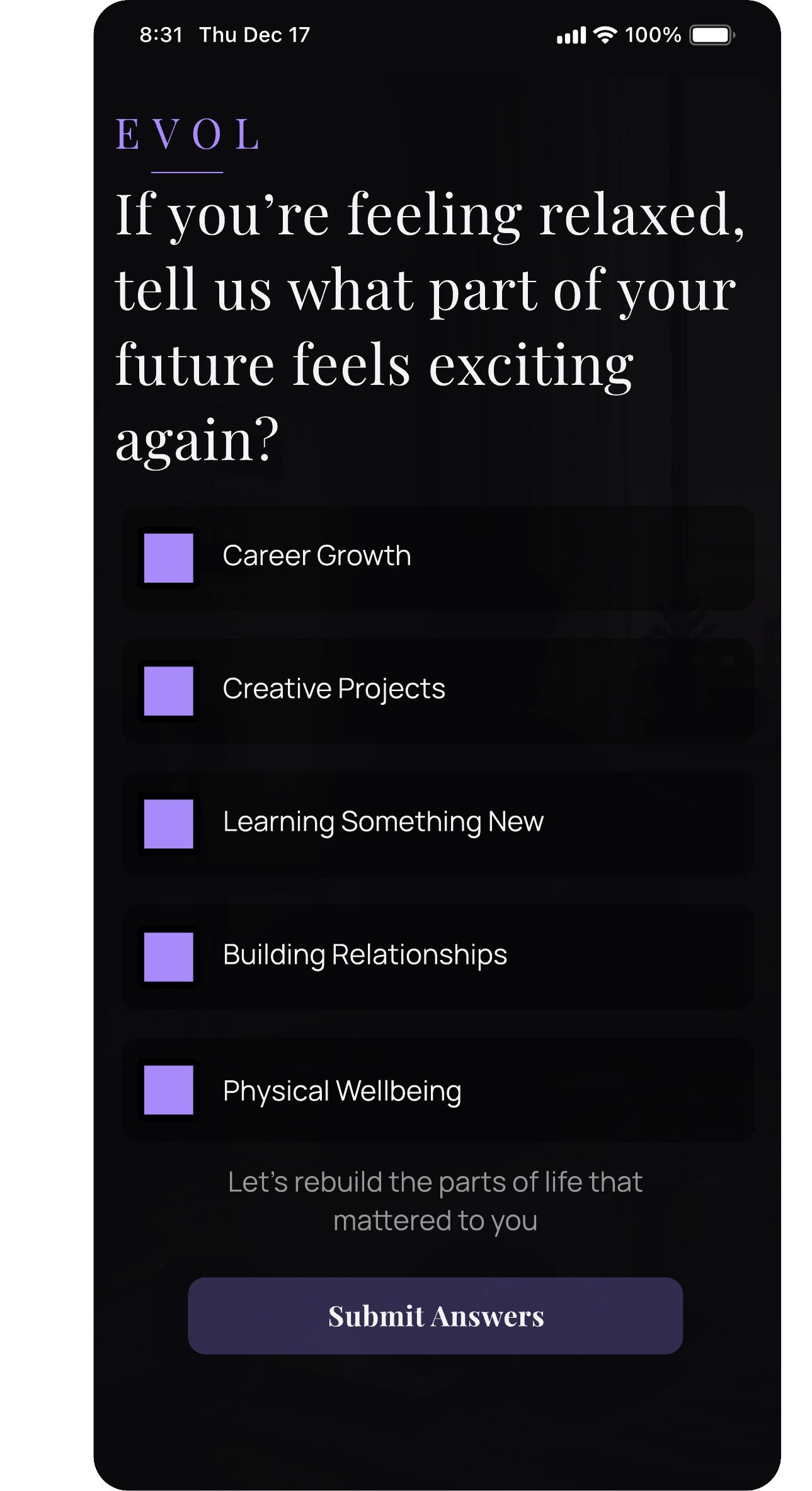
  • 7 β€” forward, not backward. What excites them about the future, tied to something concrete today.
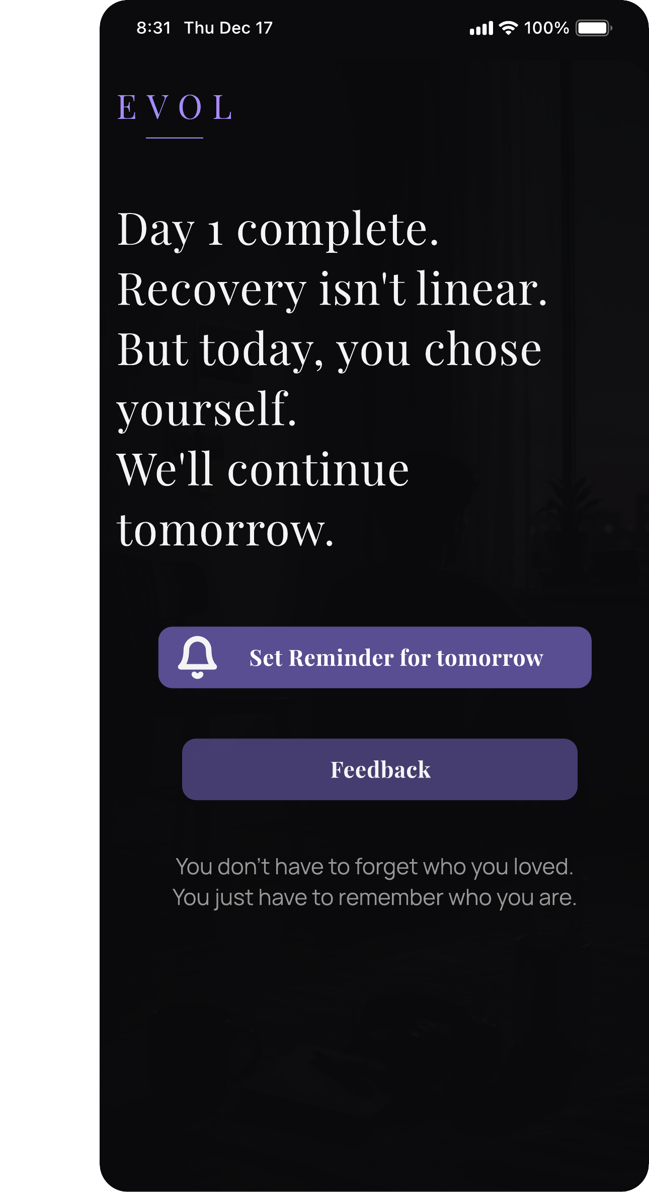
  • 8 β€” day 1, not day done. "Recovery isn't linear, but today you chose yourself."
8
β€” a colour I talked myself out of

What I almost picked

My first instinct was pure black and white β€” stark, clinical. But my notes from that stage were direct about why I dropped it: "these two colours can harm human emotions." Pure black felt harsh for someone already going through something difficult, and pure white felt sterile, closer to a hospital form than a recovery space.

Lavender purple stayed as the accent instead β€” muted and dark, not the soft, light version I'd first sketched. Purple sits between calm and intensity, which fit a project about the space between who you were in the relationship and who you're becoming after it. Kept dark rather than pastel, it reads as grounded and serious, not decorative.

For typography, I paired Playfair Display for headings with Manrope for body text β€” creating a balance between emotional warmth and readability without making the product feel clinical.

Throughout the interface, I used principles like the Peak-End Rule, Jakob's Law, Hick's Law, Law of Proximity, Law of Focus, Tesler's Law, and Fitts's Law to guide interaction decisions.
9
β€” the rule I held to

Not aimed at anyone

The intention was never to hurt anyone's emotions or attack anybody. EVOL is a recovery platform, full stop β€” somewhere anyone can find themselves again, how they were before love.

10
β€” built like a product, not just a screen flow

Every frame had to earn its cost

Decided early: this isn't just a feel-good UX exercise, it has to work as an out-and-out commercial product. So every frame gets treated like it costs something. My own note about it: "unnecessary frames or elements = unnecessary spending." Eight frames survived. Two didn't.

These eight are also a deliberate first slice, not the whole plan β€” the full arc is closer to 15–20 screens across basic, deeper, and sensitive question tiers spread over the 21 days. This first build validates the core loop; the fuller sensitive-question tiers come once that's proven.

The login screen almost got cut too β€” kept going back and forth on it. Kept it in the end, not because apps "just have one," but because a real product needs to know who's coming back tomorrow.

Small thing I noticed after the fact: the CTA usually sits at the bottom of a screen. Mine sits above three lines about privacy and not being alone. Didn't plan that as a "trust pattern" going in β€” just felt wrong to ask for a tap before saying anything reassuring first.

11
β€” the tension I had to hold

Commercial, but not exploitative

This is the part I kept getting stuck on. A normal commercial app wants you to open it again tomorrow. Fine. But EVOL wanting that for the wrong reasons β€” just to farm a streak or a metric β€” would be using someone's worst month against them.

So "Set Reminder for tomorrow" stayed, because the 21-day window genuinely needs it to work. But I kept asking myself, screen by screen: is this here because it helps them, or because it's good for retention numbers? Not sure I got that balance right everywhere. Still thinking about it.

12
β€” the rest of Day 1

More of what shipped

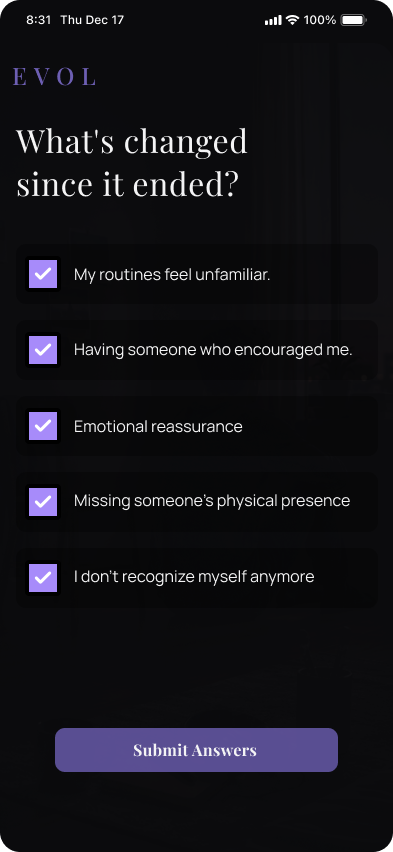
EVOL intro screen EVOL what changed after the relationship ended screen EVOL future planning screen EVOL day 1 complete screen
13
β€” written last

Reflection

The biggest challenge with EVOL was realizing that designing for emotional recovery is not the same as designing a normal productivity flow. At one point, I questioned whether features like journaling and reflection prompts were actually helping users process their emotions β€” or if they were unintentionally encouraging them to stay attached to the breakup.

That changed how I approached the product. Instead of creating an experience that repeatedly asks users to analyze what went wrong, I focused on helping them slowly rebuild their routines, confidence, and identity outside the relationship.

This project reminded me that when designing for vulnerable moments, the goal is not to provide all the answers. It is to create the right environment where users can move forward at their own pace.

I would still like to validate EVOL with people at different stages of a breakup and understand how the experience changes based on where they are in their recovery journey.

14

You don't have to forget who you loved. You just have to remember who you are.

← Back to portfolio