REDACTED
- Interview Notes (6 sources)
- Design Rule & Constraints
- Findings & Contradictions
- Timeline Reference
- Final Prototype Screens
- Open Reflection
This isn't a case study write-up. It's the actual folder — the raw notes, the sourcing, the rule I set before I opened Figma, and the parts that still bother me. Open a folder below.
Why I started this project
- Information spreads faster than verification does now. A screenshot with a fake stat and a hashtag reaches someone before any correction exists.
- By the time a correction shows up, the belief is already formed. Correcting it later barely moves anyone.
- Wanted to test something specific: can a product slow that down without becoming just another biased voice in the noise?
I started thinking about this after noticing how quickly people shared political posts on social media without checking whether the information was true. What caught my attention was not just the misinformation itself, but how confidently people believed and forwarded it. That made me question how we could help people understand context before forming opinions.
The question
- How do you verify a claim without the tool itself taking a side?
- Rule set before touching Figma: no party name, no leader name, no flag, no party colour — anywhere, ever.
- Note: harder than it sounds. History is made of specific people. Remove all of that and still tell the truth clearly — every line of copy has to survive the question "does this inform, or does this take a side?"
"A creator's success is making a political project without touching the emotion of politics."
The main idea behind REDACTED is simple: before reacting to information, users should have enough context to understand it. I noticed that people often see a post, form an opinion, and share it without knowing the complete story. So the product focuses on helping users pause, verify, and understand different perspectives before making a conclusion.
Why it had to be a real claim
- To design the "verify" flow honestly, I needed a real claim to test it against — not a hypothetical one.
- I used a real, historically documented event: the arrest of a young Tamil Nadu political figure — decades later that state's Chief Minister and his party's president — under the MISA Act during the 1975–77 Emergency, arrested at his family home the day after his father, then the state's long-serving Chief Minister, had his government dismissed in January 1976.
- I needed to know: is this true, and what's the full context most people never see?
enough real detail to show this was specific and verifiable — not hypothetical — while stopping short of naming the individual directly, the same restraint the product itself practices.
Since I wasn't alive during the Emergency, I couldn't verify this from memory or assumption. I spoke with 3 senior journalists who were active during 1977 and 3 elderly citizens who lived through the period, alongside government archives and newspaper records from that time.
What six people told me
- Journalist 1 — on scale: the arrest I was checking was one of the most significant political arrests at the peak of the Emergency, later widely referenced as a defining case.
→ Decision: confirm the claim as true and explain its significance — without naming the leader on screen. - Journalist 2 — on cause: it followed directly from a state government being dismissed in Jan 1976 — the two events were connected, not isolated.
→ Decision: add a "why it happened" section, not just "what happened" — cause and effect, without naming the government or party. - Journalist 3 — on press freedom: newspapers were censored during this period; journalists who criticised the government were arrested too.
→ Decision: build a dedicated historical-timeline section, so users understand the climate an event happened in, not just the isolated fact. - Citizen 1 — on scale of arrests: tens of thousands were detained under MISA nationally, a large share of them politicians — not one isolated arrest.
→ Decision: frame the verified incident as part of a documented pattern, sourced to records, not a standalone dramatic claim. - Citizen 2 — on who was arrested: several political figures across different parties were detained and released during this period.
→ Decision: confirmed no single-party framing was possible — arrests spanned multiple figures, reinforcing the decision to name none of them. - Citizen 3 — on scope beyond one party: national opposition figures across multiple parties were arrested; at least one non-political organisation was banned outright.
→ Decision: this was the moment "no names" stopped being a constraint and became the actual design insight — no single party owns this history.
six interviews confirmed one incident. not enough yet.
What I assumed vs. what I found
- Assumed one arrest meant one clean story with one side.
- Turned out arrests during this period spanned multiple political figures across multiple parties — not one side's narrative.
- That was the moment "no names" stopped being a constraint I was following and became the actual design insight: no single party owns this history, so the product shouldn't imply one does.
The biggest moment for me was realizing REDACTED shouldn't just tell people whether something is right or wrong. The real problem was the lack of context behind the information people consume. So I shifted the idea toward helping users understand the background and sources, instead of influencing what they should think.
What stayed unnamed
- I knew, specifically, exactly who the arrest belonged to. Six real interviews confirmed it beyond doubt.
- The final screen still doesn't say the name.
- Verification and identification are two different problems. I only wanted to solve the first one — the moment you name a leader, it becomes a claim about that leader, not a claim about the truth.
I knew the name. The research made that clear. But I deliberately left it out because the moment I named the person, the product would start feeling like it was pointing at someone. That wasn't what I wanted REDACTED to do. I wanted it to help people verify the information, not tell them who to blame.
Frame by frame
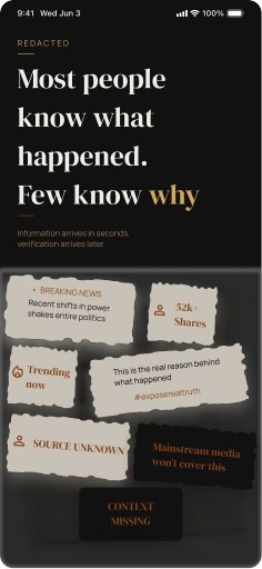
- Frame 1 — the hook: logo, one bold core line, a supporting line, then the issue itself (photos/videos). This frame's only job is attention — no accents, no CTA needed here. It has to explain why fact-checking even matters right now: fake narratives and old schemes get quietly reintroduced as new ones, and information spreads faster than facts do.
- Frame 2 — how it actually spreads: a must-have frame. Explains what's happening and how — through WhatsApp, Twitter/X, Instagram, Facebook groups, propaganda setups. Even mainstream media often isn't covering these or calling out the misleading narrative. This frame needs a CTA to move forward.
- Frame 3 — the heart of the project: accepts any link — video, short, reel, news article, post. A small note near the field: "check whether what you're watching on the internet is true or not." Below the search bar: "spend 10 minutes for knowing the truth" — a deliberate nudge to keep the user in the app rather than bouncing off. Closes on a quote.
- Frame 4 — confirm before revealing: this frame won't tell any story. It just asks the user whether the pasted content is correctly understood. If yes → Check Fact button. If not → Paste another link.
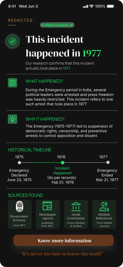
- Frame 5 — verified true: tells the user the claim is true and happened in the stated year. Deliberately combines present and past — the point is that this product isn't just for checking today's claims, it's for understanding history, culture, and tradition too. Exit leads back to the homepage with a thank-you.
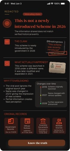
- Frame 6 — verified false: the polar opposite of Frame 5. States plainly that the incident in the content didn't happen at that time — and often, the "new scheme" being claimed is actually an old, existing scheme quietly rebranded by a government. A "Know the Truth" button reveals the real facts with sources — Wikipedia, TN Government records, and others.
- Frame 7 — close the loop: ends with a thank-you gesture and a nudge to keep checking information regularly. Closing line: "Truth must be told very louder, because false making more sounds."
until frame 3: no party name, no flag, no leader, no allegations against anyone. the user just gets told true or false — nothing else.
What each choice is doing
- Typography: Garamond for headings, Manrope for body — a serious, editorial pairing rather than a typical app font stack.
- Light black (backgrounds/graphics) → awareness. Sets a serious, alert tone without going aggressive.
- Light orange (accents) → attention. Used sparingly, only where the eye needs to land first.
- Light white (text) → contrast. Keeps everything legible against the darker base without turning harsh.
I wanted the colors to guide attention, not emotions. Once I started designing with that in mind, every color had a clear job.
Where Frame 1–7 actually came from
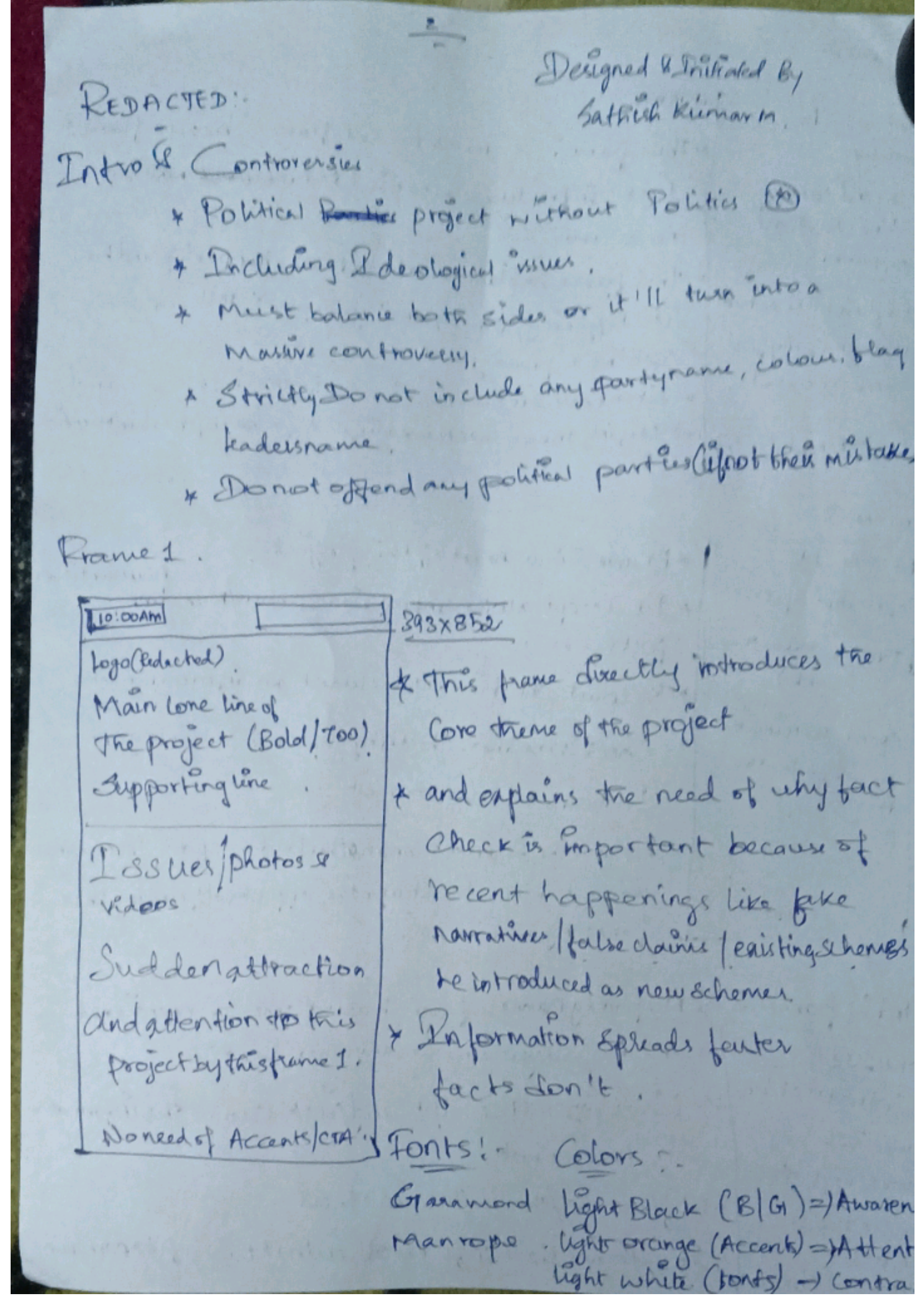
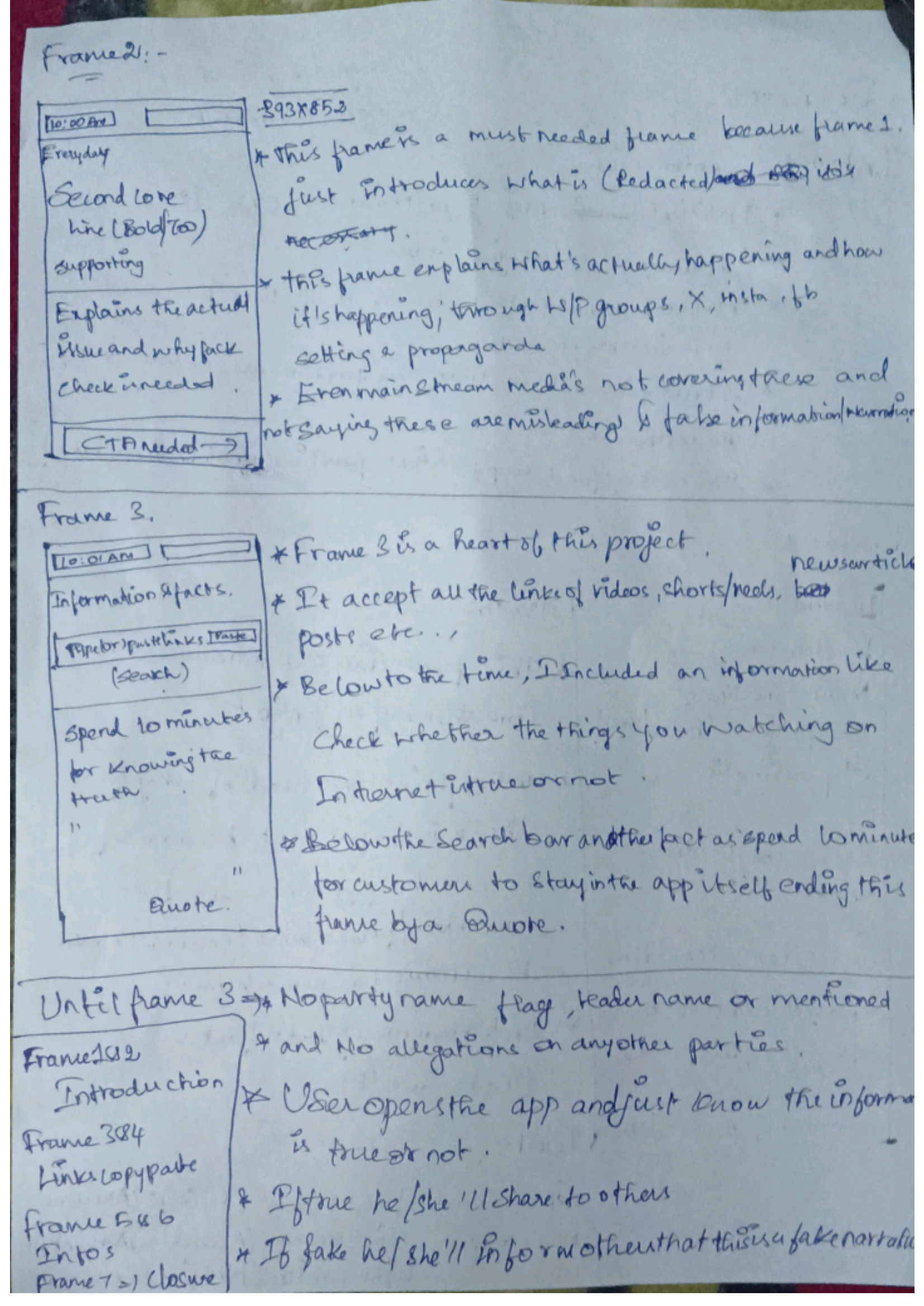
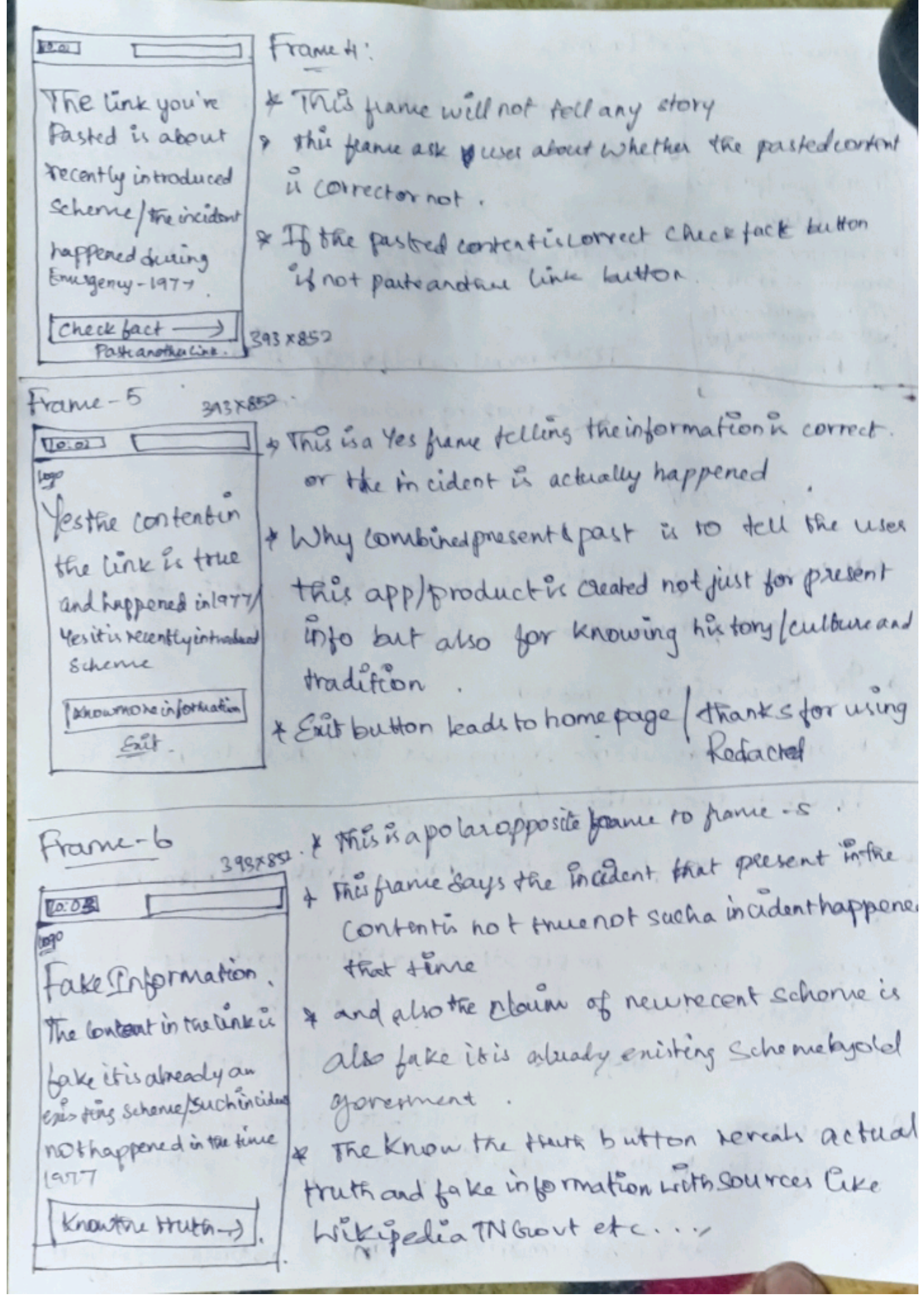
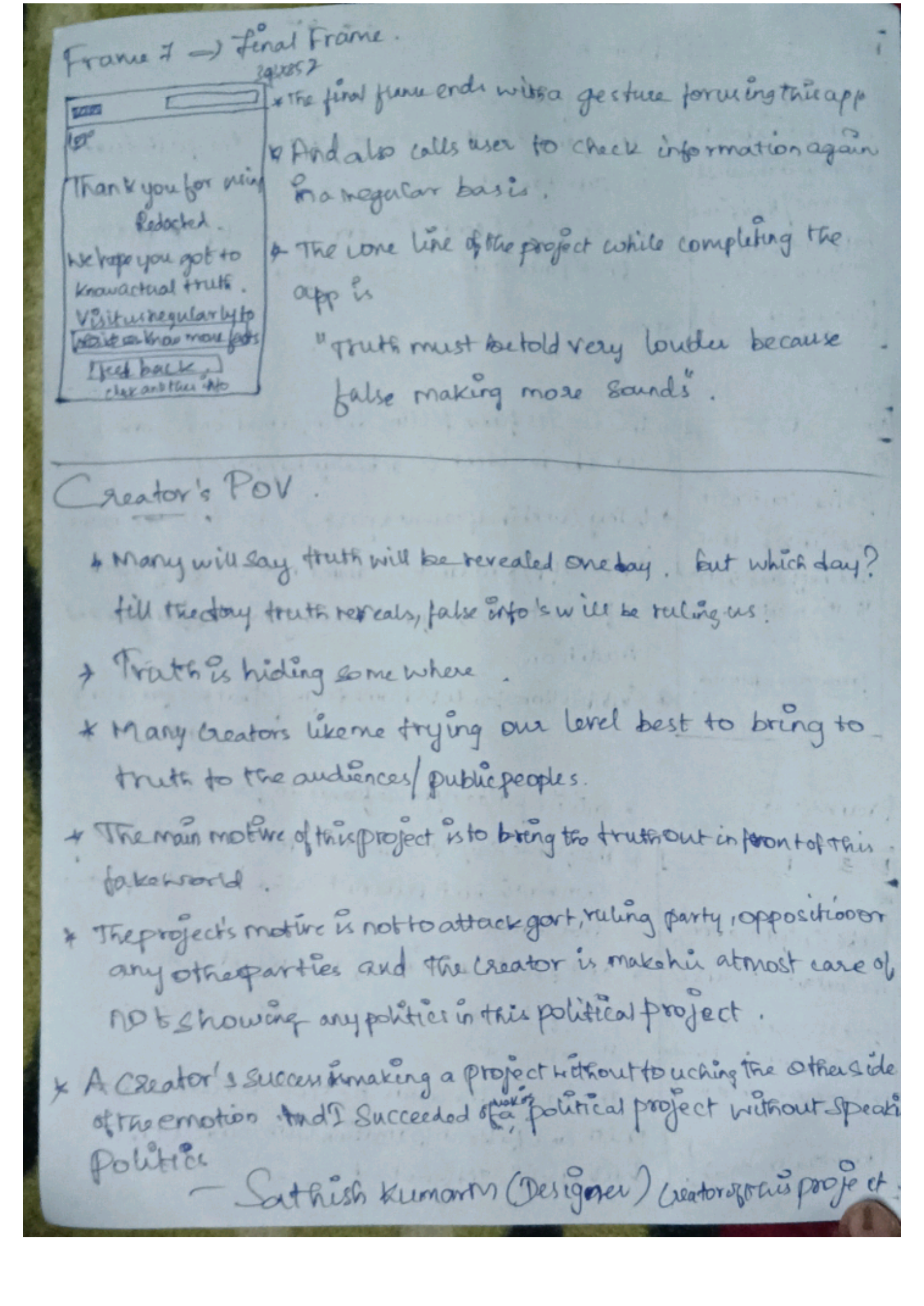
these four pages are the real thing — every frame decision above was reasoned out here first, on paper, before Figma.
Why this, and not something louder
- Many will say the truth gets revealed one day. But which day? Until then, false information keeps ruling.
- The truth is hiding somewhere. Creators like me are trying, at our level, to bring it back in front of people.
- The project's motive was never to attack any government, ruling party, opposition, or any other party — I stayed careful not to let any politics show through in a political project.
- A creator's success is making a project without touching the other side of the emotion. I set out to make a political project without speaking politics — and I got there.
What shipped
What I'd still want to fix
- Six interviews confirmed one incident. That's not enough for something that claims to be neutral.
- I never tested whether the neutrality actually reads as neutral to people across different political leanings — only to me.
- Talking to journalists and elders who actually lived through it changed how I think about "research" for a project like this. I couldn't design this responsibly from what I already assumed I knew.
What I Learned : One thing I struggled with during this project was finding the right balance. It was easy to think the solution was simply showing what is correct or incorrect, but that approach felt too controlling. I had to step back and rethink the role of the product. The goal became less about correcting people and more about helping them understand information better.