← BACK TO PORTFOLIO FIELD LOG — MADURAI, TN
Field Journal / Sathish Kumar M

SafeRoute TN

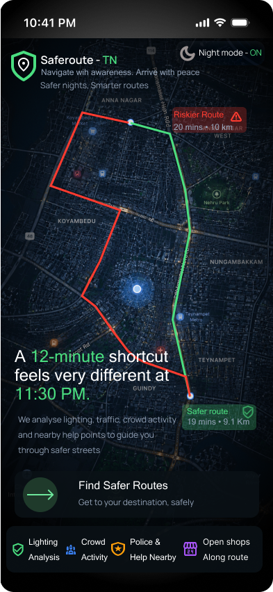
"A 12-minute shortcut feels very different at 11:30 PM."

Two months of walking Madurai's streets at night before I opened Figma. This is that log — what I saw, what I got wrong, and what changed the design.

SCROLL TO BEGIN
01
23:00 — NIGHT ONE

The first night

This is the project I'm most proud of, because it forced my engineering mindset and social responsibility to actually work together. Instead of opening Figma for another common app flow, I went outside first.

The starting question was simple to ask and hard to sit with: what if a navigation app optimized for how safe a route feels, not just how fast it is?

I didn't start this project behind a laptop. I started it after noticing how differently people experience the same road after dark. While walking through familiar streets in Madurai one evening, I kept wondering why a route that felt normal to me could feel unsafe to someone else. That question stayed with me long after I got home, and eventually it became SafeRoute TN.

02
FIELD NOTE

The road I stopped trusting

Somewhere in those two months, a specific street changed how I thought about "fastest route." Technically shorter. Felt wrong to walk at night — low light, no open shops, nobody around.

I remember stopping for a moment and looking around. The road wasn't completely dark, but there were broken streetlights, empty stretches, and very few people. Nothing had happened that night, yet it was easy to understand why someone wouldn't feel comfortable walking there alone.

Kalavasal — pickup point Arasaradi — where the routes split Simmakal — destination Kalaignar Statue, Thilagar Thidal Madura Coats Pvt Ltd via New Jail Road (NH 85) Solamalai Theatre Periyar Bus Stand Railway Junction
■ felt-safe route — via Solamalai Theatre, Periyar Bus Stand, Railway Junction    ■ risky route — via New Jail Road, Madura Coats
03
FINDINGS — WEEK 3–6

Things existing apps never mention

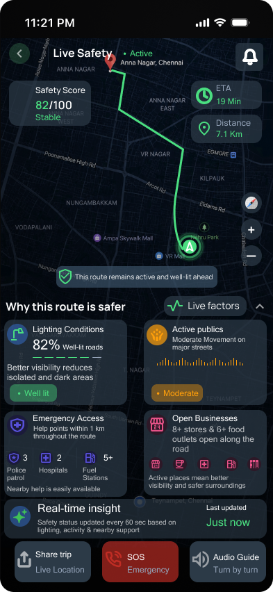
Finding 01 — lighting. Users avoid poorly lit streets even if they're faster.
→ Decision: add lighting visibility as a route factor, and show why a safer route is recommended, not just that it's recommended.

Finding 02 — public activity. People feel more confident when there are open shops, public movement, and support zones nearby — not just lower crime statistics.
→ Decision: surface public activity, open businesses, and nearby support markers along the route itself.

Finding 03 — tone. Safety tools can become fear-based if the copy is too dramatic.
→ Decision: use calm, clear language that supports a decision without panic or blame.

Finding 04 — autonomy. Users still need to choose for themselves. They won't always take the "safe" route, and the app shouldn't force it.
→ Decision: compare fast and safe routes side by side instead of pushing one over the other.

none of this shows up on a normal maps app.
04
EARLY CONCEPTS

EARLY DIRECTIONS

These concepts capture the stage where the product's direction started becoming clear. I explored how to help users make safer choices through route comparisons, visible safety signals, and accessible emergency tools. As the designs evolved, the focus shifted from reacting to danger to preventing it—making the experience feel reassuring rather than fear-driven.

SafeRoute TN hero route wireframe SafeRoute TN route explanation wireframe
SafeRoute TN emergency readiness wireframe

The moment everything clicked was when I realized safety isn't the first thing users are looking for—they're looking for a way to get home. The design should help them do that safely, not constantly remind them they're in danger

05
DESIGN DECISION

Safety-first route comparison

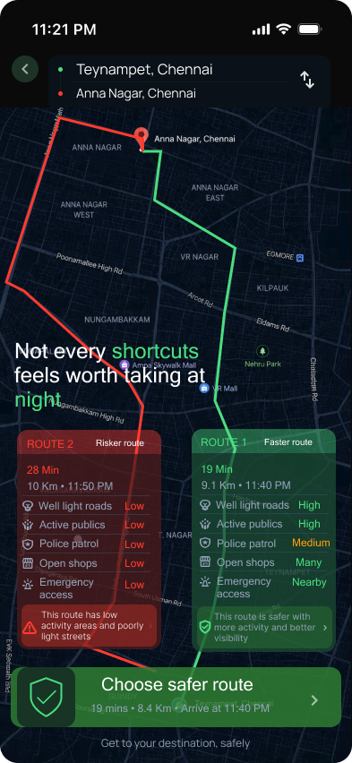
SafeRoute TN safety-first route comparison screen

Users are willing to spend extra minutes if the route feels safer, especially during late-night travel.

Decision: introduce Safety Mode alongside Fastest Route, so users can see the trade-off and compare it instead of blindly following the shortest path.

Why it matters: the interface makes safety visible through lighting, public activity, and support access — so users understand why a route is recommended, not just that it is.

06
DESIGN DECISION

Trusted circle & emergency readiness

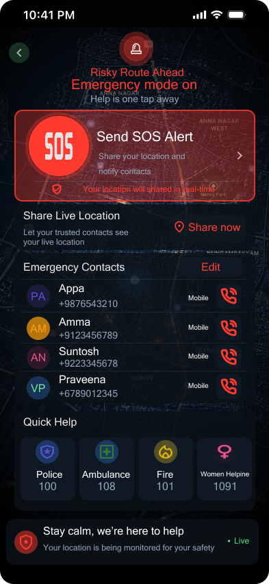
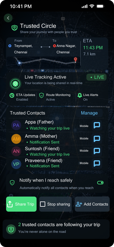
SafeRoute TN trusted circle and emergency screen

People feel more confident when trusted contacts and emergency actions are easy to reach during night travel.

Decision: keep emergency support visible but calm, so the product feels reassuring instead of visually aggressive or fear-based.

Why it matters: safety tools should support decision-making without creating panic. The user stays in control while help remains close.

What I Simplified : My early ideas focused heavily on emergency features, including a large panic button on the home screen. During research, I realized users wanted confidence while planning their route—not constant reminders of danger. I simplified the experience by prioritizing safer route guidance and keeping emergency actions available only when needed.

07
MAP REF

Fast vs. felt-safe

■ felt-safe route (recommended)    ■ fastest route

This project taught me to balance technical feasibility, social responsibility, emotional sensitivity, and product clarity. Walking the streets before designing wasn't just research — it was a reminder that good design starts with understanding real human behavior in real places.

If I continued this project, I'd test how users actually understand the safety indicators, and how much route explanation is helpful before it starts to feel overwhelming instead of reassuring.

← Back to portfolio